|
Page 5: Appendix B — Tiffany.com Screen Shots |
| Are You Sure? After users choose to view the enhanced version, Tiffany.com asks them again if they do, indeed, want to get the Flash site. Quite wise. 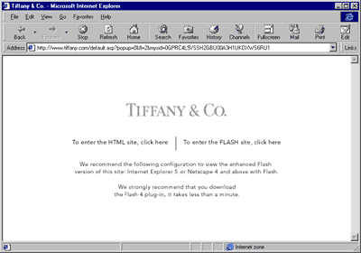 Home Page The home pages are very similar, except the Flash users get a rotating diamond ring upon entering. (HTML site always shown first unless otherwise noted.) 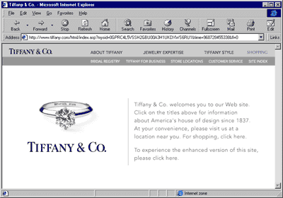 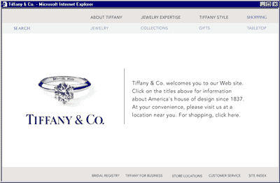 Shopping Home Page The shopping home pages are also similar, except the Flash users got an animated ribbon at the top of the page. They both use drop-down menus to drill into the different product subsections. 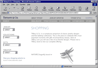 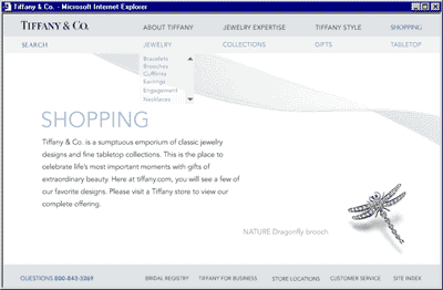 Item List Page There is divergence between the two sites on the item list page. The HTML version says "page n of X" at the top of each page. The Flash site offers only back and forward arrows, which confused users because it was difficult for them to tell exactly where they were in the product list. Also on the Flash site, there is no text accompanying the product photos, which forces users to click on the item detail to even see the item name. 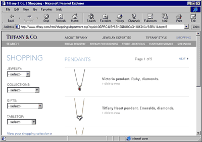 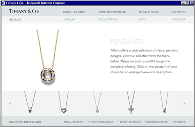 Item Detail Page Two of the four people testing the Flash site (bottom) were confused by the non-standard "Add to Cart" functionality. They thought they had added an item to their cart when they had not. I would quote what they said after realizing they had to do it over, but this is a family-oriented web site. 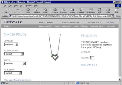 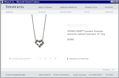 Shopping Cart Page Both sites use the same shopping cart page, built in HTML. Every user had a hard time returning to shopping, probably because the link is in the upper right-hand corner of the window. 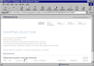 |
| « back to appendix A | start over |